Wellness Exhibition
Exhibition Design · Brand Strategy · ASU Herberger · Spring 2026
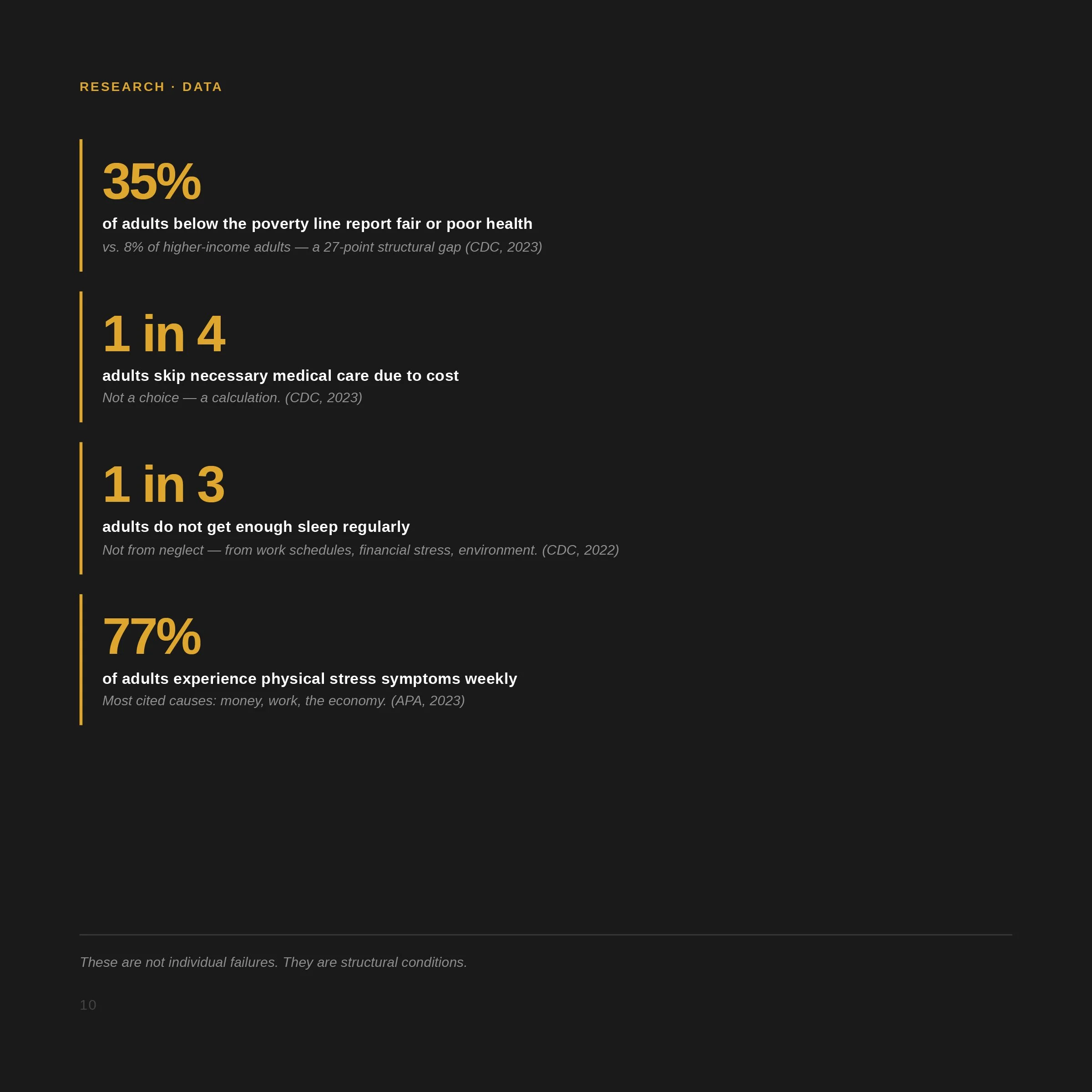
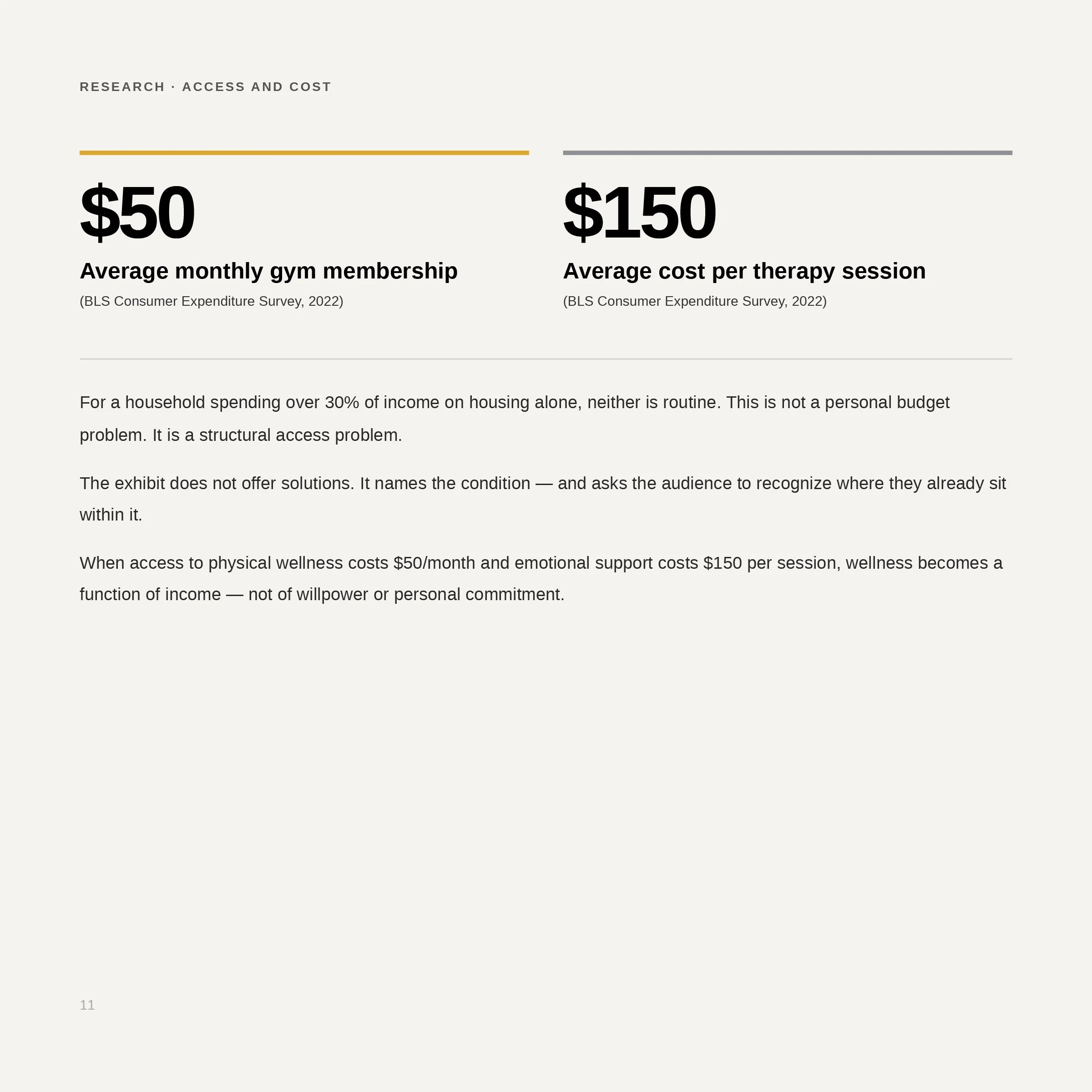
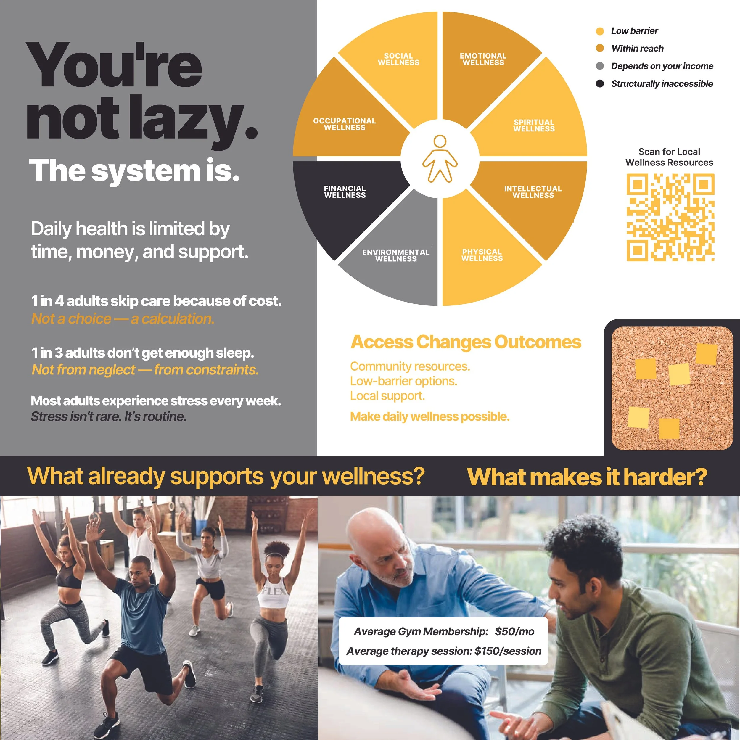
Most wellness communication tells people to do better. This project asked who built the system that makes doing better so hard. The brief was a physical exhibit panel for the ASU Senior Exhibition - the design problem was to catch the attention of someone who had already stopped reading public health posters. The answer was a direction shift: from affirmation to confrontation, from blue-and-white clinical to charcoal-and-gold argumentative. "You're Not Lazy. The System Is." The two decisions were the same decision.
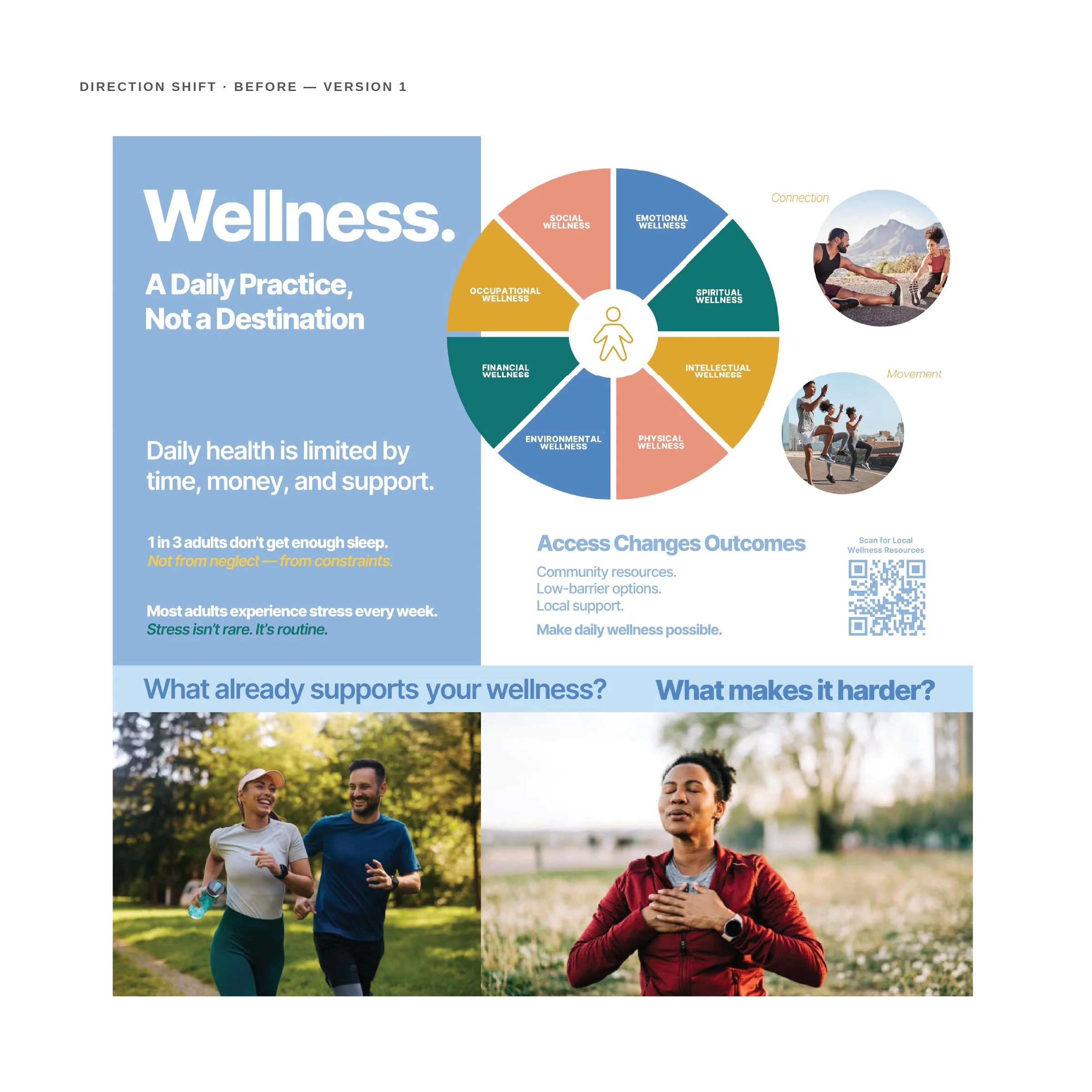
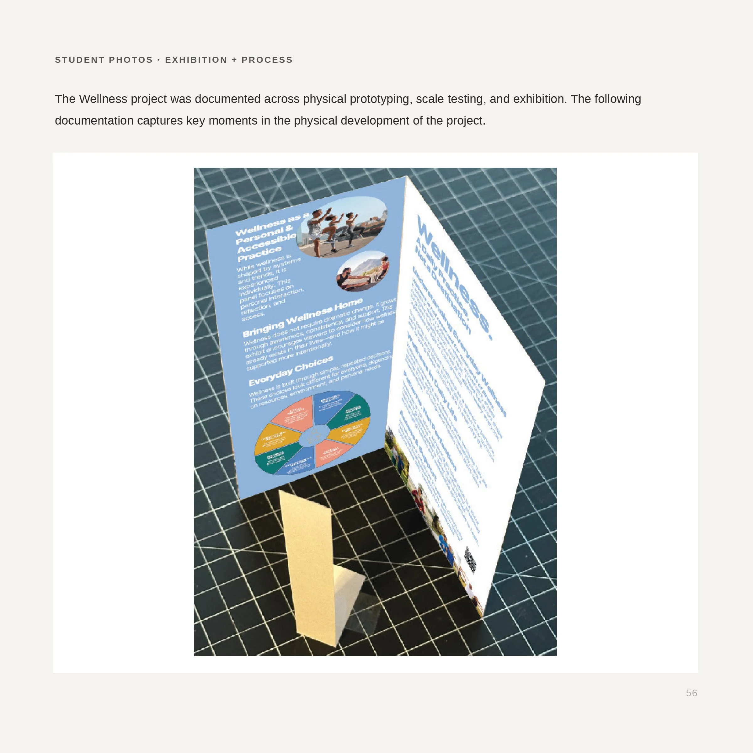
The first version was blue and white. Approachable, clinical, indistinguishable from the material it was trying to replace. It was built, printed at scale, and tested. It failed immediately. The pivot to charcoal and gold happened at the same moment the headline changed. Both decisions were the same decision.
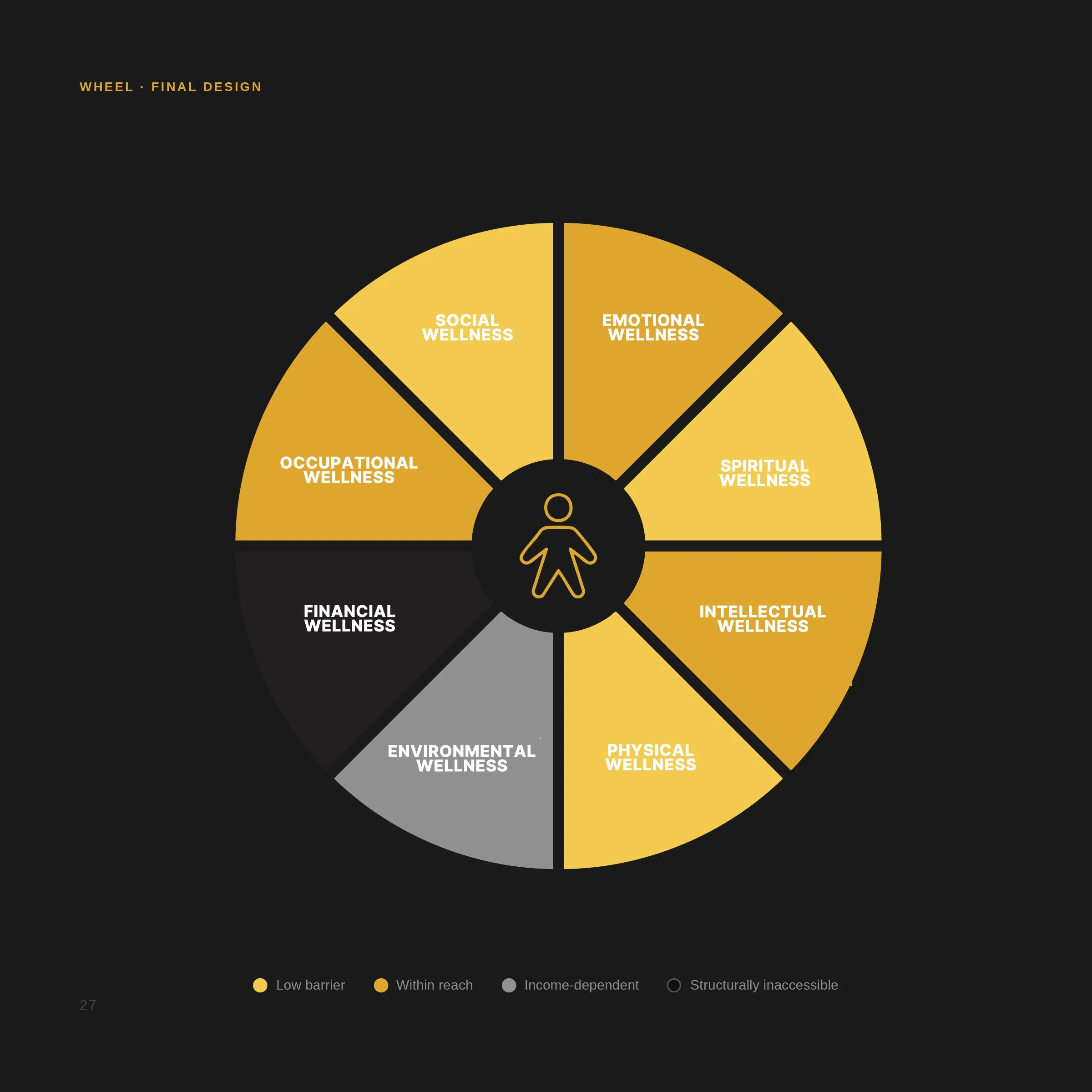
Eight domains from the National Wellness Institute model. Color reflects structural access, not aesthetic preference. Gold is low barrier. Near-black is financially inaccessible. Financial Wellness is the darkest segment deliberately.