Nike After
Brand Identity · Packaging Design Structural Design · Spring 2026
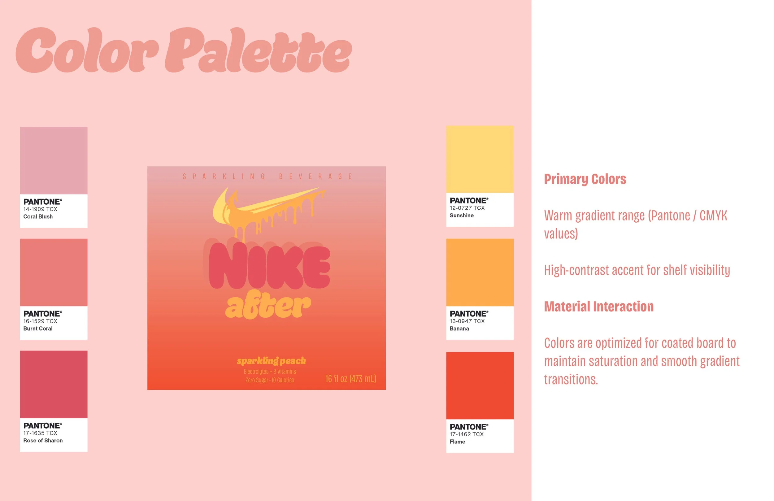
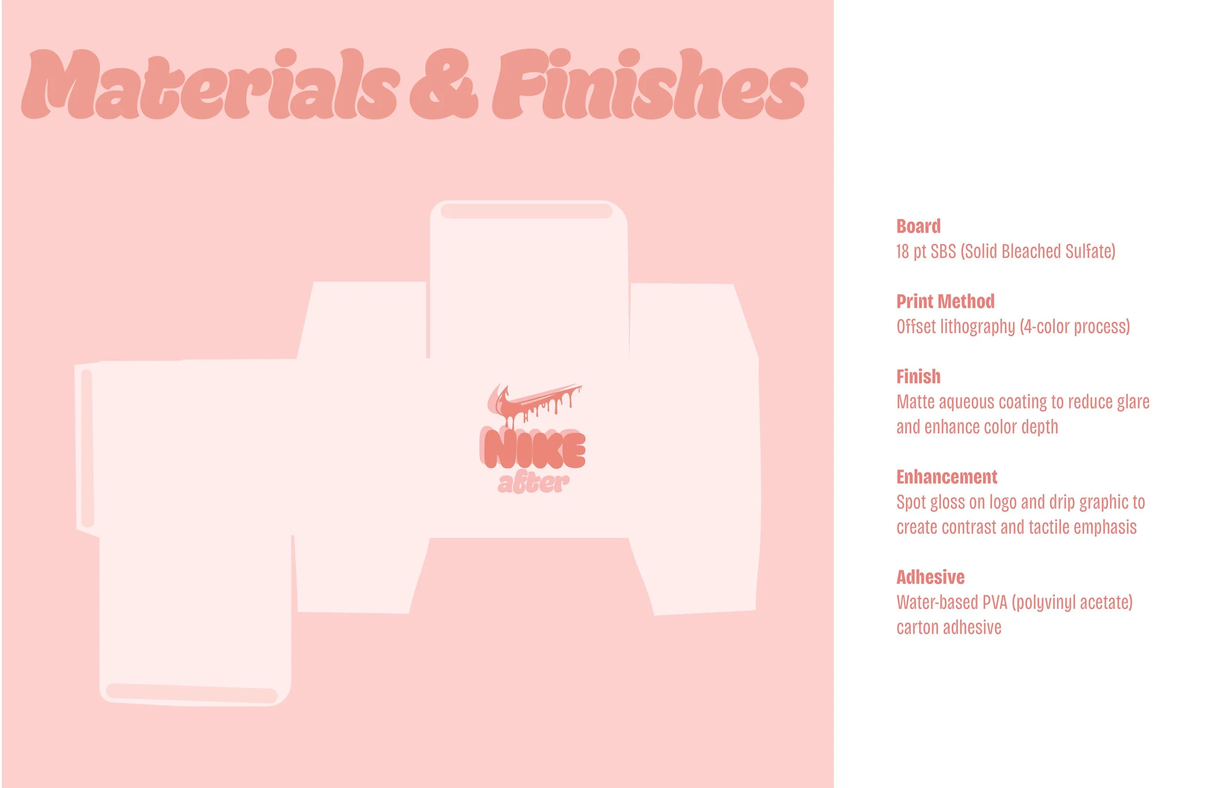
Nike doesn't make a recovery drink. This project asked what it would look like if they did. The drip swoosh connects the product back to its source. Bubble typography softens the brand's intensity without losing it. The warm gradient moves from exertion to rest. The system was designed as a complete commercial object: three flavors, a monocarton, Pantone-specified throughout, built to a production dieline.
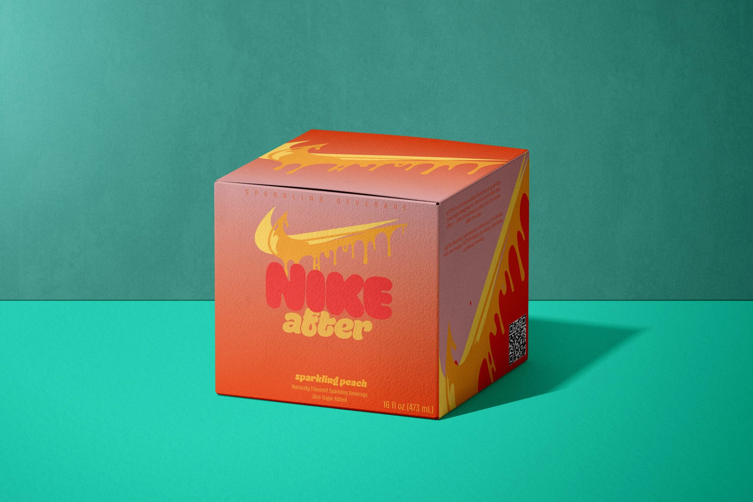
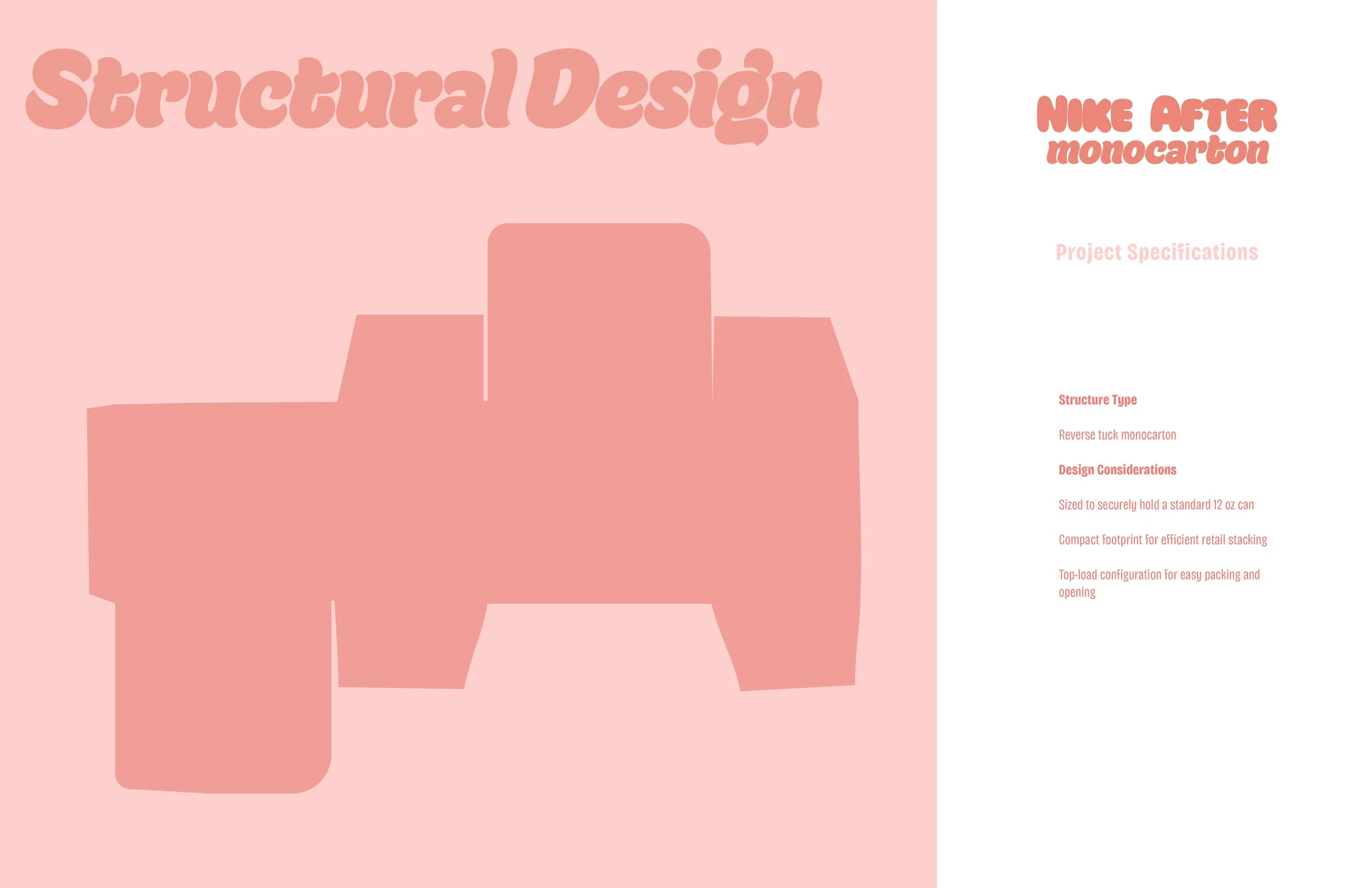
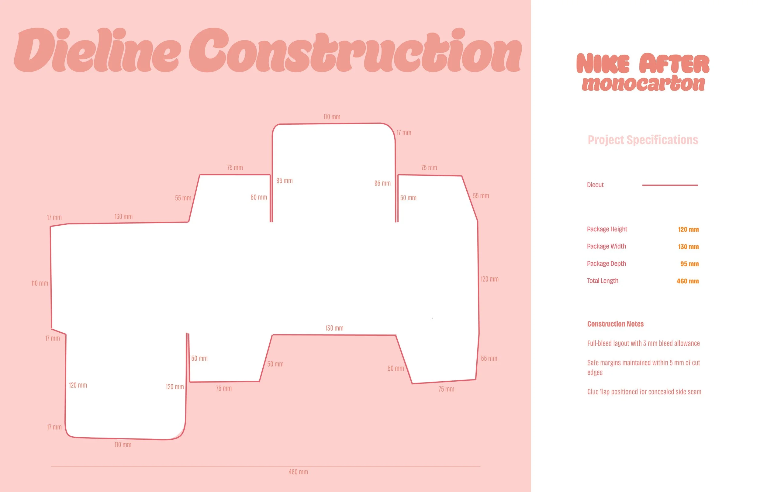
Reverse tuck monocarton. Sized to hold a standard 12oz can. Compact footprint for retail stacking.
The drip motif wraps the structure so the brand reads from every angle.
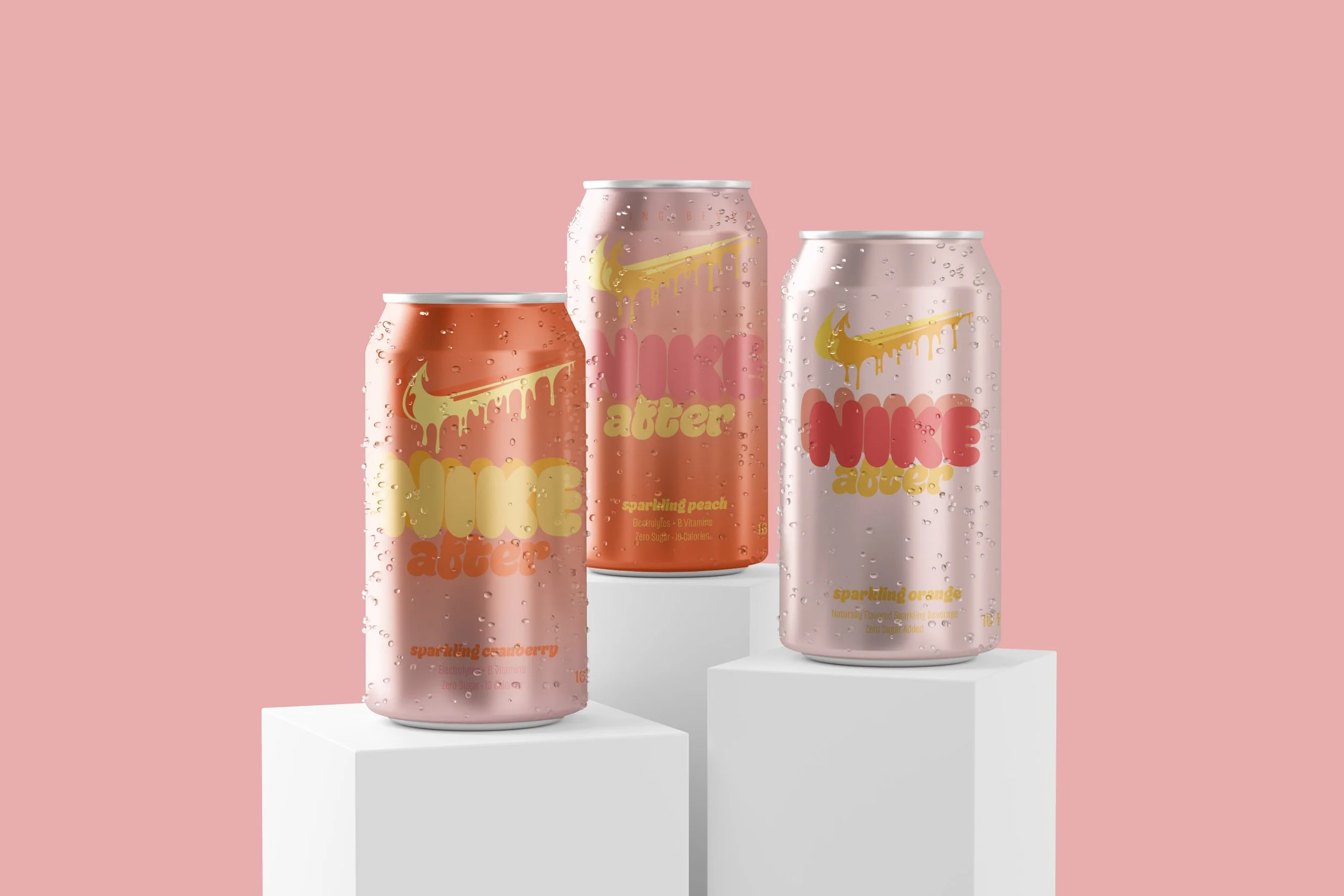
Three flavors. Sparkling Cranberry, Sparkling Peach, Sparkling Orange.
Each colorway shifts within the same warm family while staying immediately recognizable as a system.